Our Story · The Logo
Love Letters From Nature.
A correspondence between people, place and belonging.
Inspired by the intimacy of handwritten letters, the brand is built around the idea that every destination has a story waiting to become part of your own.
The Signature
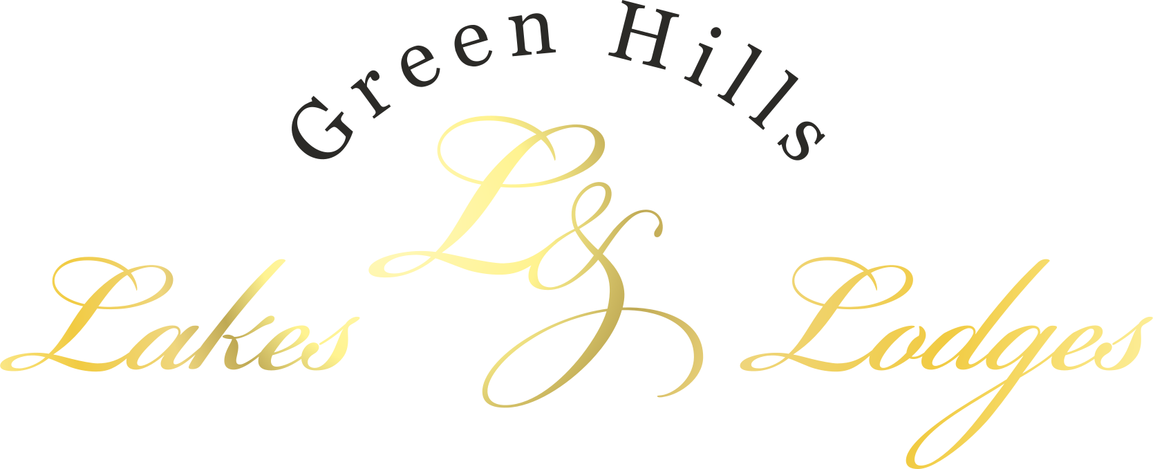
Green Hills, Lakes & Lodges
The primary logo combines the Green Hills location signature with the Lakes & Lodges wordmark.
The L&L monogram is inspired by historic postage stamps and handwritten correspondence. It represents personal correspondence, craftsmanship, permanence and heritage.
The Stamp
A seal of authenticity
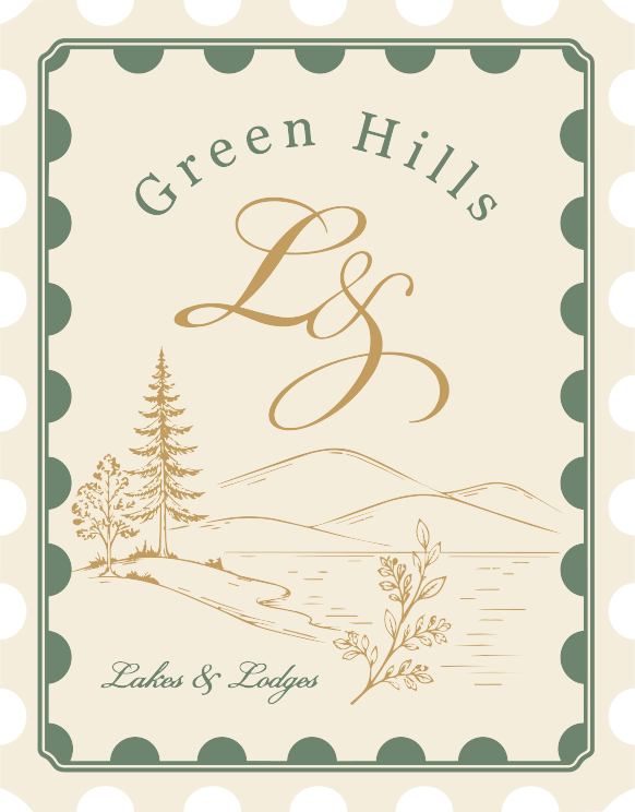
The circular design combines the large monogram with a clean written signature. The circular typography creates a seal of authenticity and destination.
The Stamp Philosophy
Each destination receives its own stamp.
The master structure remains unchanged while illustrations adapt to local surroundings — allowing the identity to grow naturally whilst remaining instantly recognisable.
Brand Essence
What the signature stands for
Purpose
To create exceptional places where people can invest in a slower, more intentional way of living — surrounded by nature.
Vision
To become Europe's most distinctive collection of premium lakeside and nature lodges, offering unique investment opportunities in extraordinary locations.
Mission
To develop thoughtfully designed lodges that combine timeless architecture, natural surroundings and lasting value, creating places people are proud to own.
Brand Promise
Every lodge is more than a property — it's a place to belong, to reconnect, and to create a legacy of meaningful moments.
Brand Values
Five quiet principles
Presence
Luxury is being fully where you are.
Authenticity
Nothing feels manufactured or artificial.
Intention
Every detail serves a purpose.
Connection
A deeper relationship with nature, self and place.
Quiet Luxury
Understated elegance over excess.
Brand Personality
A trusted advisor, not a traditional estate agent
We are
- Refined
- Poetic
- Calm
- Thoughtful
- Natural
- Timeless
- Elegant
- Collected
We are not
- Trendy
- Corporate
- Loud
- Overly luxurious
- Rustic cliché
- Adventure-focused
Colour Palette
Luxury comes from restraint
Deep Lake Navy
#123F56
Primary brand colour
Parchment Beige
#F3EDE3
Backgrounds and editorial layouts
Sage Green
#577B67
Location-specific accents
Ecru
#C4BD9D
Location-specific accents
Gold is reserved for luxury details only — never as a dominant colour.
Typography
Handwriting, warmth and clarity
Bickham
Display script
For the monogram, signature moments and editorial highlights — personal handwriting and correspondence.
Georgia
Primary serif
For headlines and editorial storytelling — warmth and literary elegance.
Degular
Supporting sans serif
For navigation, captions and wayfinding — clarity and contemporary balance.
Graphic Elements
Space is content. Silence is part of the design.
Postage stamps are the core storytelling element, joined by subtle postal references and minimal hand-drawn line art.
Time to collect your stamps of nature
Back to Our Story